Font types are extremely important when making a magazine of even publishing anything on social media. This makes it stand out and how it conveys on the change of little sequences that look like the fonts that the fit the genre of specifically of what has to be shown.
Examples:
 This example shows that the music magazine is a Rap genre. the heading used two color which sets out the original look of the magazine. which suggest that the color used different fonts of colors for the heading to make it stand out more. With Rap magazine they normally portray bright colors but this magazine signify the rap music and the other gossip related to the rap artists
 In addition, this magazine demonstrates bright colors that contrast the music article genre POP. this magazine shows the billboard results for the recent TV show for the results of the best pop artist. the colors show that the makers wanted to catch the target audience eyes by providing blue, pink and yellow colors which stand out from many other magazines such as the grime magazine example at the top.
as to the font types these are the font types that will be demonstrated within m magazine. such s the headlines, sub headings, writing techniques etc:
 1) with this font i will be using it within the the main front, double and content page for the title of my magazine which is M.M.A.L. i may use this font type to get the audience intrigued with its bold italic deigns that is very eye catching when placed with color.
 2) with caviar dreams i will be using this for the text within the content, double page and front over for the sub headings, headlines and the rest of the text used in black. This will be used to add a unique effect to create a magazine that looks different from other music magazines
 For my magazine i used the Sanchez font type for the maths head. i used the color black had made it stand out as the background color was very pale. the size of the maths head is 46 pixels which i think its a suitable head size.
 For my main headline i had used Caviar Dreams in a strong font edit and n bold italic to make it stand out from the picture within the center of the page. the color is the same as the main title as if i had placed another color such as 'white' it would have taken away the attention from the main picture so black was the best colour for the text used on my main front cover.
Examples:
 This example shows that the music magazine is a Rap genre. the heading used two color which sets out the original look of the magazine. which suggest that the color used different fonts of colors for the heading to make it stand out more. With Rap magazine they normally portray bright colors but this magazine signify the rap music and the other gossip related to the rap artists
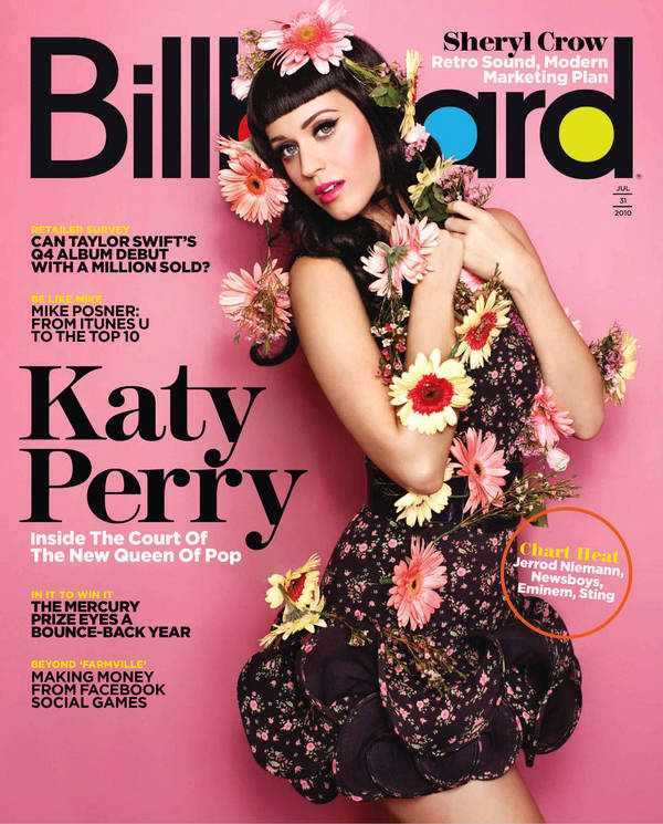
as to the font types these are the font types that will be demonstrated within m magazine. such s the headlines, sub headings, writing techniques etc:

 2) with caviar dreams i will be using this for the text within the content, double page and front over for the sub headings, headlines and the rest of the text used in black. This will be used to add a unique effect to create a magazine that looks different from other music magazinesFor my magazine i used the Sanchez font type for the maths head. i used the color black had made it stand out as the background color was very pale. the size of the maths head is 46 pixels which i think its a suitable head size.
 For my main headline i had used Caviar Dreams in a strong font edit and n bold italic to make it stand out from the picture within the center of the page. the color is the same as the main title as if i had placed another color such as 'white' it would have taken away the attention from the main picture so black was the best colour for the text used on my main front cover.
Comments
Post a Comment